Mucha Do About Something
Yes, that subject line is bad but you should have seen the other options
Hey, There,
Let’s talk about Alphonse Mucha! Or, really, let’s talk a little about Alphonse Mucha and use that as an excuse to wallow in some of his fantastic art.
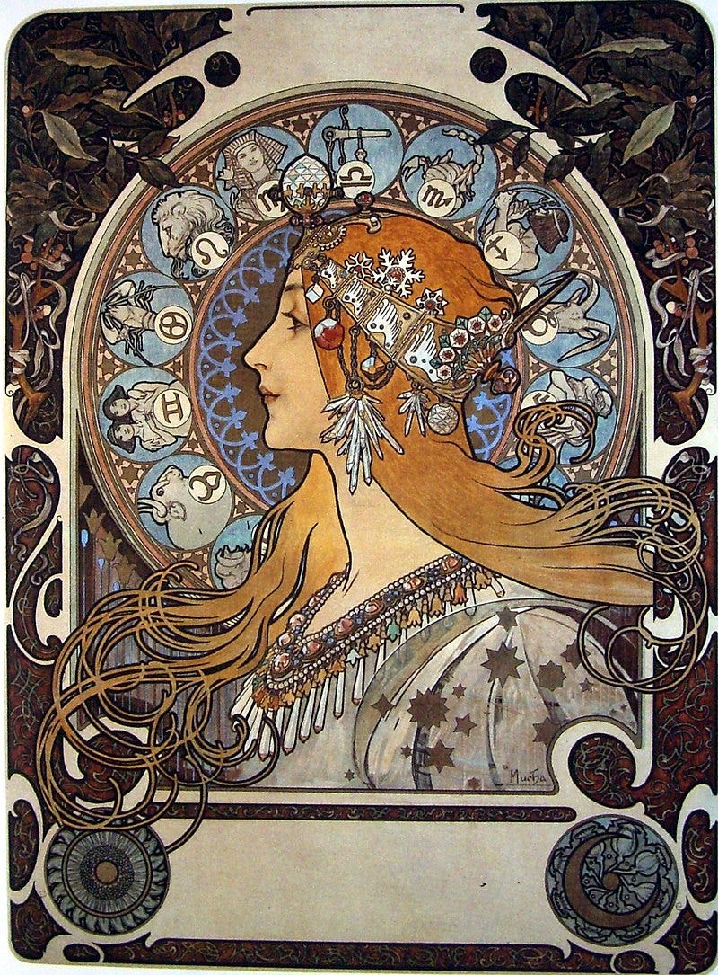
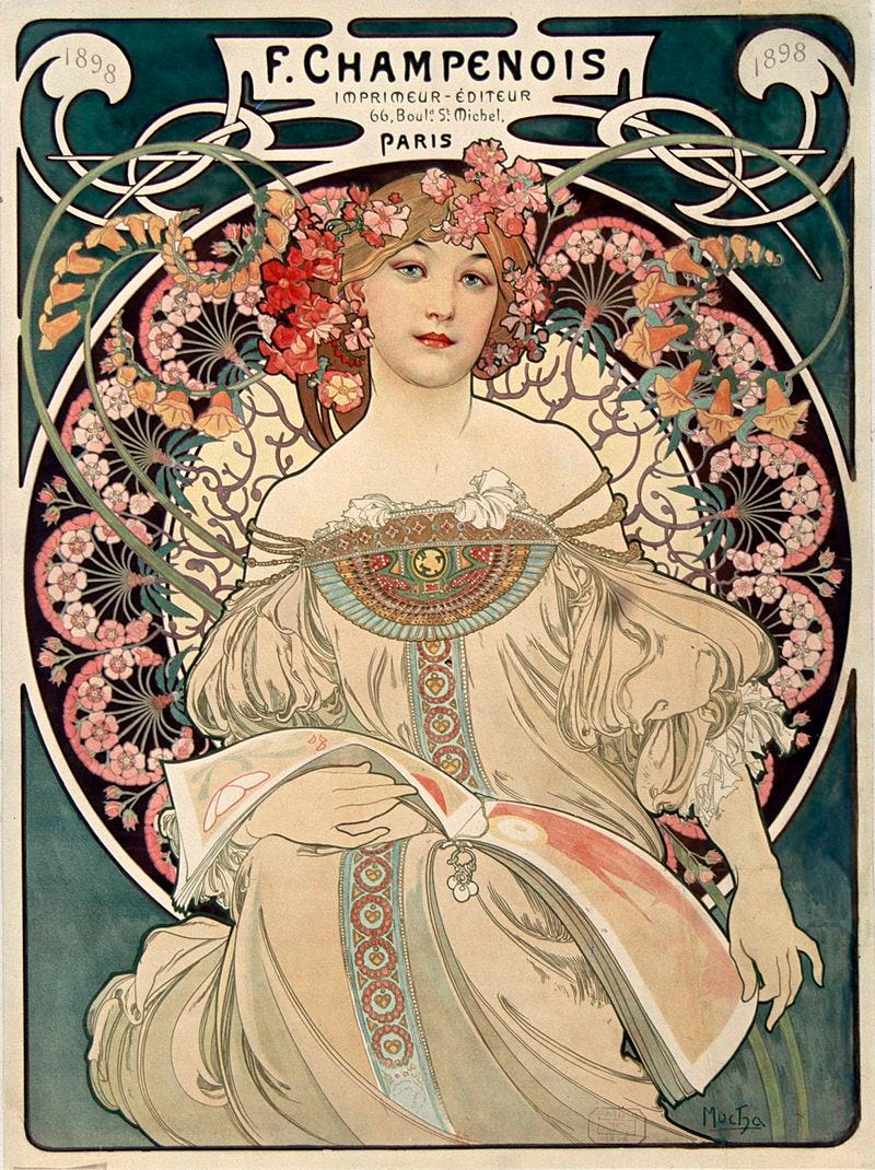
“Who’s Alphonse Mucha?” you might be asking. He was a ginormously influential illustrator around the turn of the 20th century, and even if you don’t recognize his name, I can just about guarantee that you’ve seen some of his work:

Mucha was born in Austria* in 1860. He spent his youth trying to make a living as an artist in the Austro-Hungarian empire, first getting rejected from art school in Prague and then finding work as a scenery painter for theaters. By 1888, he’d drifted to Paris, where he established himself as an illustrator for magazines and advertisements.
*Technically, anyway. European borders have shifted a lot since then, and actually shifted during Mucha’s lifetime. He was actually from—and strongly identified with—the region that would eventually become Czechoslovakia and then the Czech Republic, and that nationalist identification actually wound up dominating the back (and less artistically interesting, AFAIC) half of his life.
This illustration work is what Mucha is known for now. He quickly established himself as a master illustrator. Mucha certainly didn’t invent the aesthetic style known as Art Nouveau, but he both incorporated its elements (flowing, asymmetrical geometry; omnipresent representations of nature; conventionally beautiful women) and became one of the leading figures to popularize it. If someone asks you to tell them what Art Nouveau was, you could do a lot worse than to just show them a Mucha poster.

In 1894, he did a show poster for the actress Sarah Bernhardt that blew up, and he subsequently became the go-to ad man for the biggest intercontinental star of the day.

So let’s talk a little more about the aesthetics of Mucha’s posters, and how they’re conflated with Art Nouveau. There’s an interesting forward-backward thing going on, time-wise, that matches up nicely with the way the turn of the 20th century was itself sort of a historical estuary where different eras coexisted. On one hand, Mucha’s work (and the Art Nouveau movement it exemplified) looked backwards. The idealized women were almost always drawn in old-fashioned clothing, often classical. The nature and flowers called back to a romanticization of nature, typified by Art Nouveau pioneer William Morris.

Strawberry Thief, William Morris

Mucha gets his Morris on
The typography in Mucha’s posters tends towards the old-fashioned, or at least to the voluptuously curved (as opposed to the straight and angular typography coming into vogue among Modernists at the time). But the biggest backward glance is the way Mucha’s design and composition echoes Byzantine mosaics, which, once you see, you can’t really unsee.

Byzantine mosaic of Empress Theodora, about 550 a.d.

Another Mucha Bernhardt poster; check the compositional echo of the Byzantine mosaic. And for that matter, check out how often in this and the other examples Mucha uses lines to suggest mosaic texture.
At the same time, though, there is a forward-looking, futuristic-for-1890 element at play with Mucha. His entire career as an illustrator is based on the fact that his illustrations could be mass-produced by improved printing technology. On one hand, this has a huge technical impact on what he can and can’t include in the art; he has to rely on strong, easily-reproduced linework (as opposed to, say, lots of fine hatching), and his coloring choices would have been limited to what could be reproduced with the technology of the time.
This mass-printing has another futuristic implication, too: by being an artist who gained fame through mass-produced advertising posters, Alphonse Mucha absolutely anticipated a lot of Andy Warhol’s entire program about the democratization and devaluation of fine art; the difference being that Mucha just up and did it, without making a big deal about it, while making a big deal about it was to some extent all Warhol had.

Warhol’s mix of art and advertising was much more pointed and less beautiful than Mucha’s.
Another thing that was futuristic about Mucha’s work, albeit far beneath the surface, was some of his process. Mucha was working just as photography was revolutionizing art and people’s perceptions of it. Mucha, like many of his contemporaries, exploited this by enthusiastically embracing photo references for his illustrations. His method of doing this was a little bit unusual, though; Mucha went out of his way to amass a collection of photographs of beautiful women, and would then just pop open the hot-lady file and browse for a good face and pose every time he set out on a new project. People cursed to follow the comics world of the 21st century will see a weird prefiguration here of the awful career of Greg Land, the guy who made a career with Marvel by tracing porn stills and then drawing costumes onto them. However, even if both men worked from a shady horndog methodology, it’s important to note that Mucha managed to produce enduring, groundbreaking, beautiful work while Land’s oeuvre is just a mountain of shit.

Greg fuckin’ Land does a Marvel comic.

…although this Mucha panel from the 1900 Paris Exposition shows that our boy wasn’t above letting his horndog flag fly when he did his tracing, either.
Apparently, Mucha himself didn’t fully agree with me that his illustration work was beautiful and groundbreaking; in the second half of his life, he decided that it was shallow and a distraction from his true calling, which was making art that encouraged Czech nationalism. So he stopped the illustration and spent decades making rather bland, boring art about Czech greatness. And no shots fired against Czech greatness! Prague’s supposed to be a great city. But Mucha’s nationalist art is a big step down, in my humble.

Part of Mucha’s Slav Epic, 1912.
Mucha considered his Czech nationalist stuff to be his true life’s work. I guess the lesson is maybe that even great artists aren’t always aware of what actually makes their work great.
Right on. Be safe.
RECOMMENDATION
As part of our ongoing quarantine seminar on English queendom, we rewatched The Favourite the other night. And MAN is that a great movie. It’s hilarious, it’s tense, it’s visually beautiful, it’s damn near a perfect movie. Olivia Colman, Rachel Weisz, and Emma Stone all give never-better performances, and the script is just the damnedest thing I’ve ever seen. And somehow, it’s all at least somewhat accurate, at least on the big-picture situational scale.
SOME LINKS
While we’re talking about Mucha, if you’re a Twitter user your time there might be improved if you follow this account that just spits out Mucha art every so often. The guy who set that up did the same thing with other artists, findable from that link, and it’s great to follow a bunch and add some art to your social media experience.
This is in no way timely or relevant to anything, but its one of my favorite pieces of music writing: about a decade ago, Keith Richards published his autobiography, which was fun but also took a lot of time shitting on Mick Jagger. Music writer Bill Wyman (whose life has been immensely complicated by the fact that he shares the name of the Stones’ original bassist) then wrote a lengthy review-response in character as Jagger. Whatever you think of the Stones and Jagger, Wyman’s piece is top-shelf music writing.
CLOSING STUFF
OK, so here at the bottom, sorry for the ragged copy editing; my deal with myself was to keep this fast and loose, which is gonna mean typos. On the other hand, that also means it’ll actually come out, instead of being obsessed over.
If you have any thoughts/reactions/what have you about this, I’d love to hear about it, either by email or on Twitter. And if you know anybody who might dig this, please forward it on to them, or send ‘em the signup link! And thanks!

